“Madre filled in the missing pieces with our overarching strategy. We’re super proud of the new brand and feel confident it’ll take us where we need to be in the next five years.”
Ed Tribe | Co-Founder Journee
Matching people to their most exciting trip yet.
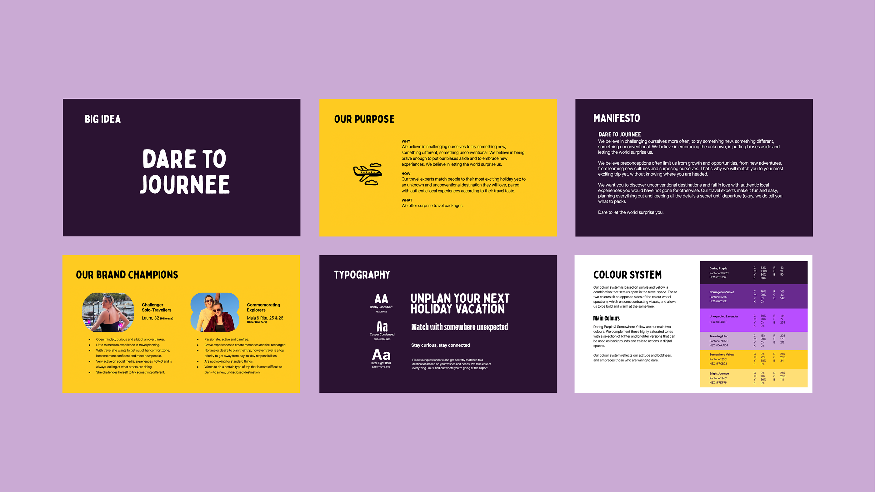
We grounded ourselves in the needs, wants, gains and pains of Journee’s brand champions, empathizing and understanding what is most valuable to them. Why do they “really” go on these trips? The insights we unlocked became the playbook to becoming more relevant to the right crowd and clarifying the brand’s purpose.
In the past, the brand focused on embracing differences, cultural curiosity and spreading love. And that, of course, is important and engrained in its DNA. However, through insights, we understood that the appeal generated by discovery, adventure and self-growth ranked higher for their explorers. The idea of daring oneself to grow and embrace new experiences drove us to articulate the brand’s big idea: Dare to Journee.
Unconventional destinations. Surprise Guaranteed.
It was essential to strengthen Journee’s value proposition beyond the surprise factor.
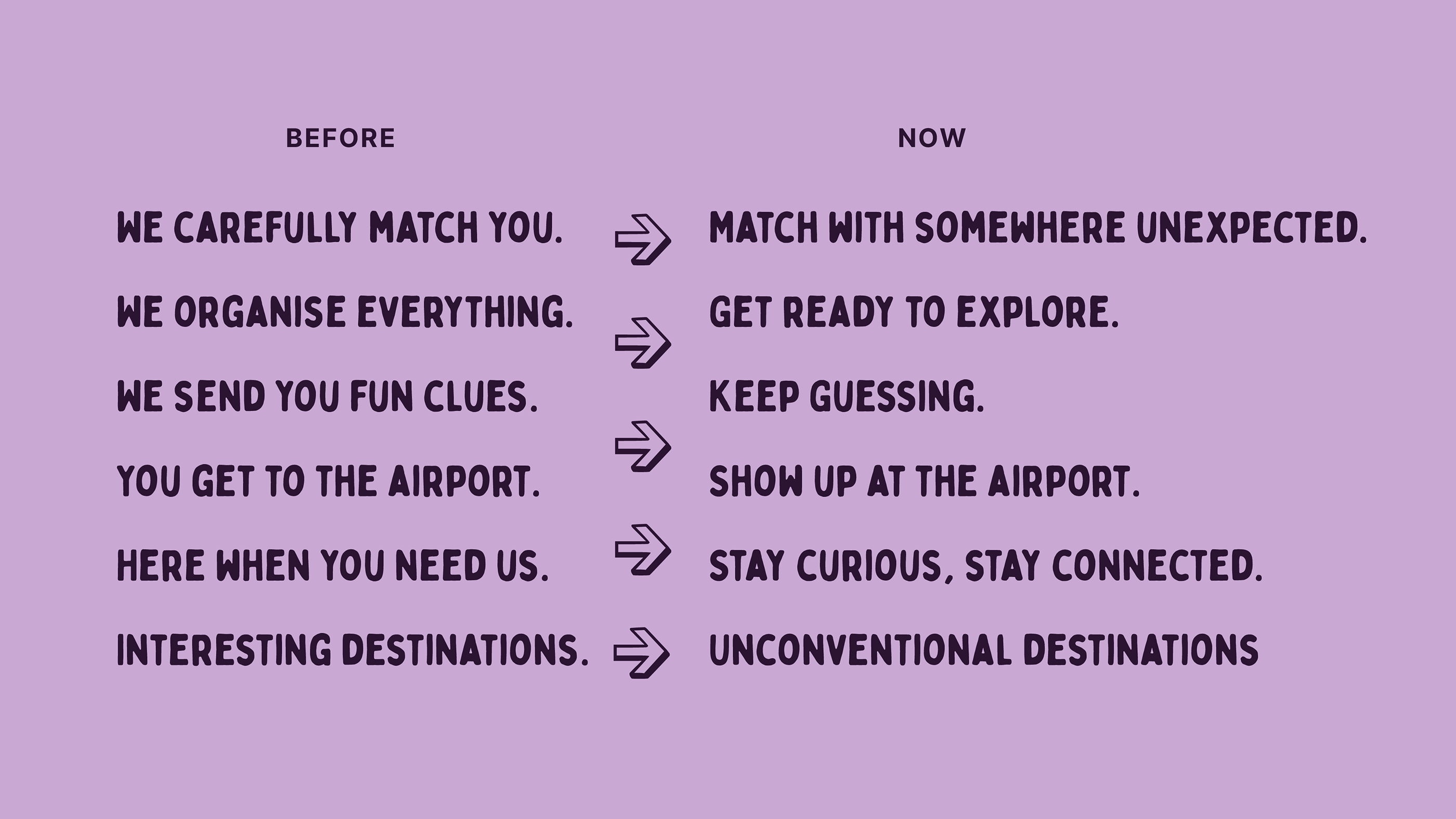
We identified that Journee’s offer was mostly made of off-the-beaten-path destinations, but somehow, this wasn’t being communicated. We pushed to ditch the common destinations to turn them into a rock-solid differentiator and cater more precisely to their type of people.
Giving their audience the power to discover something new, to be the first among their tribe to go on a trip without knowing the destination first, and to travel somewhere they wouldn’t have chosen for themselves made Journee increasingly relevant to its critical audience.
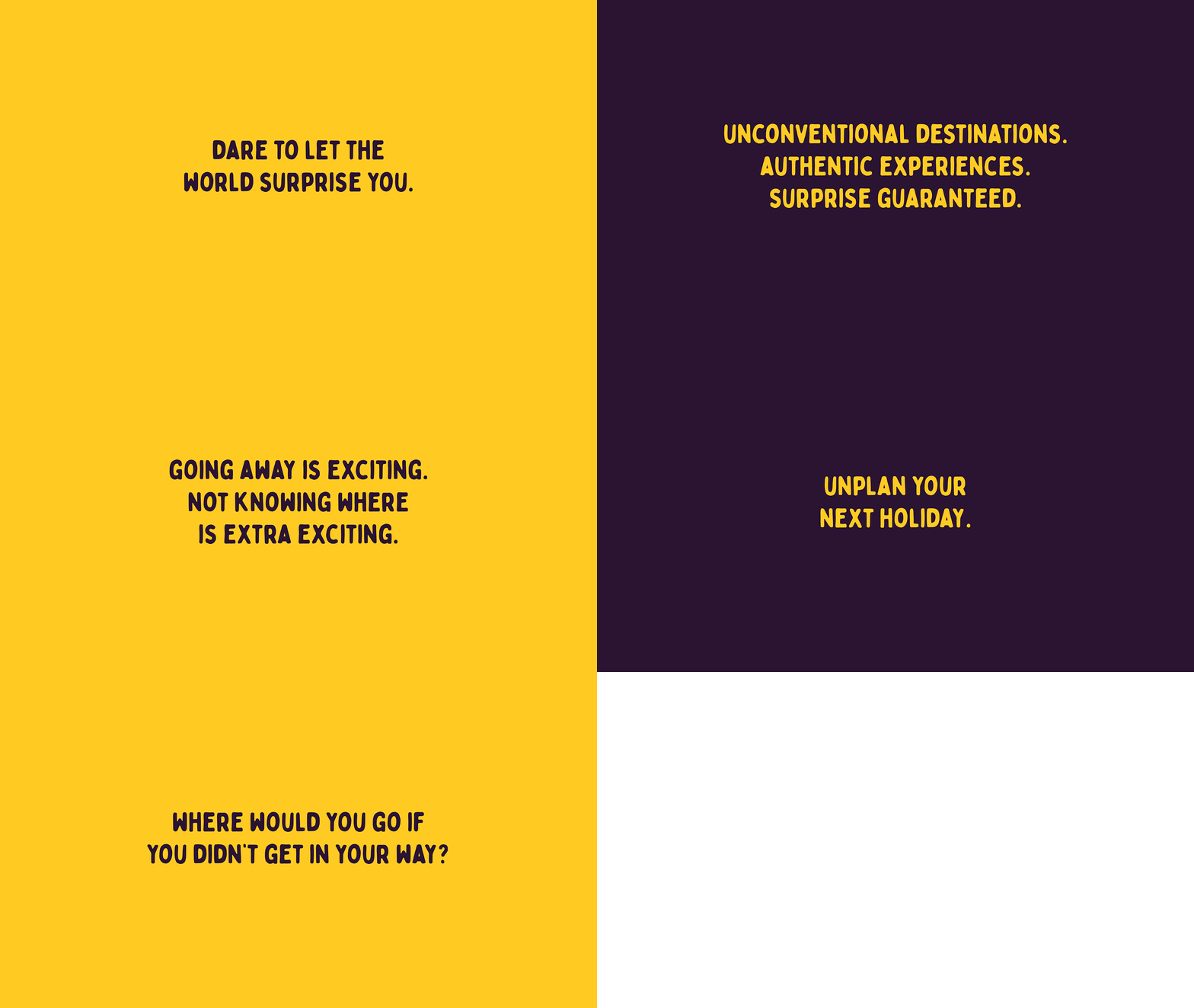
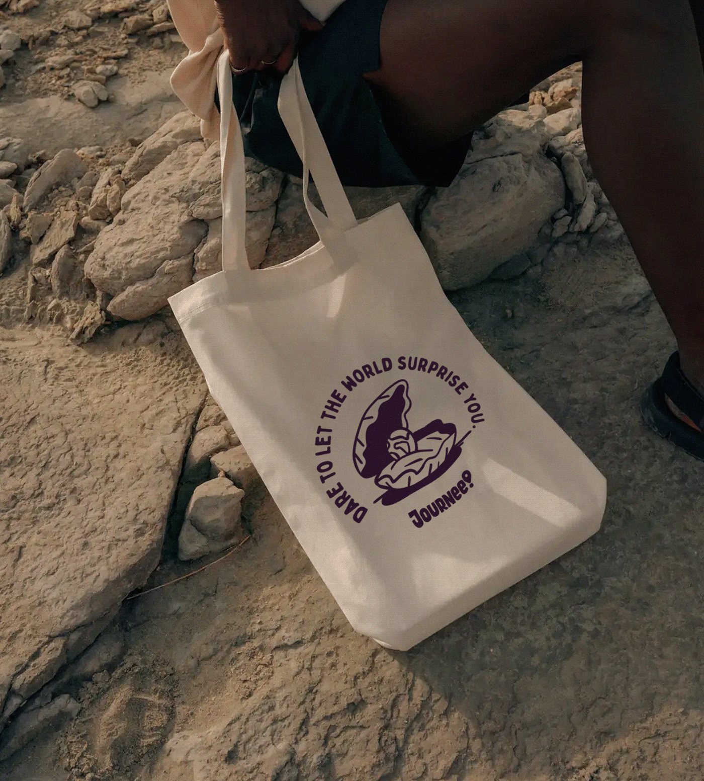
Dare to let the world surprise you.
Dare to Journee encapsulates the brand’s personality into a powerful concept that verbalizes the brand’s name. In addition, it gave Journee the conceptual platform to build stronger emotional connections and match the product’s excitement to its messages, becoming a hero brand that inspires and empowers people. This triggered a significant shift in the brand’s overall messaging, focusing less on what the brand can do and putting the spotlight on what people can achieve. They are the heroes of their journey.

A visual Journee
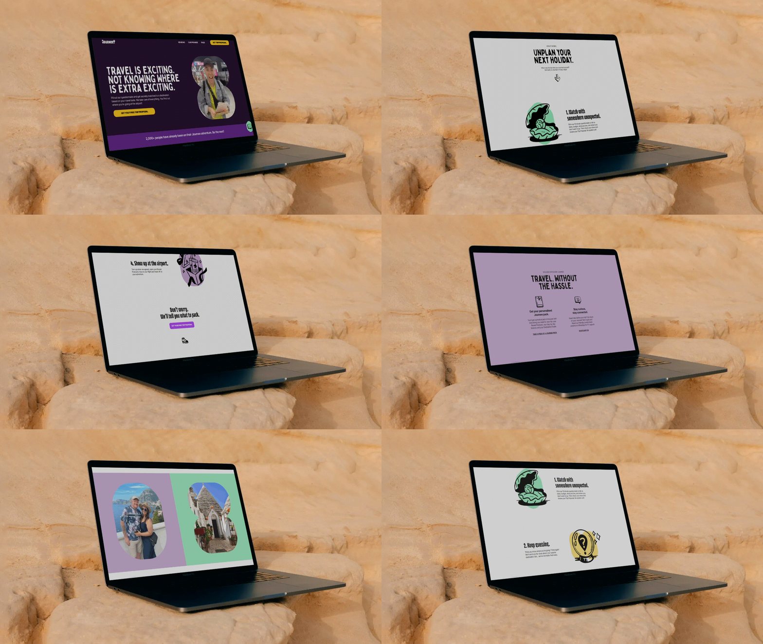
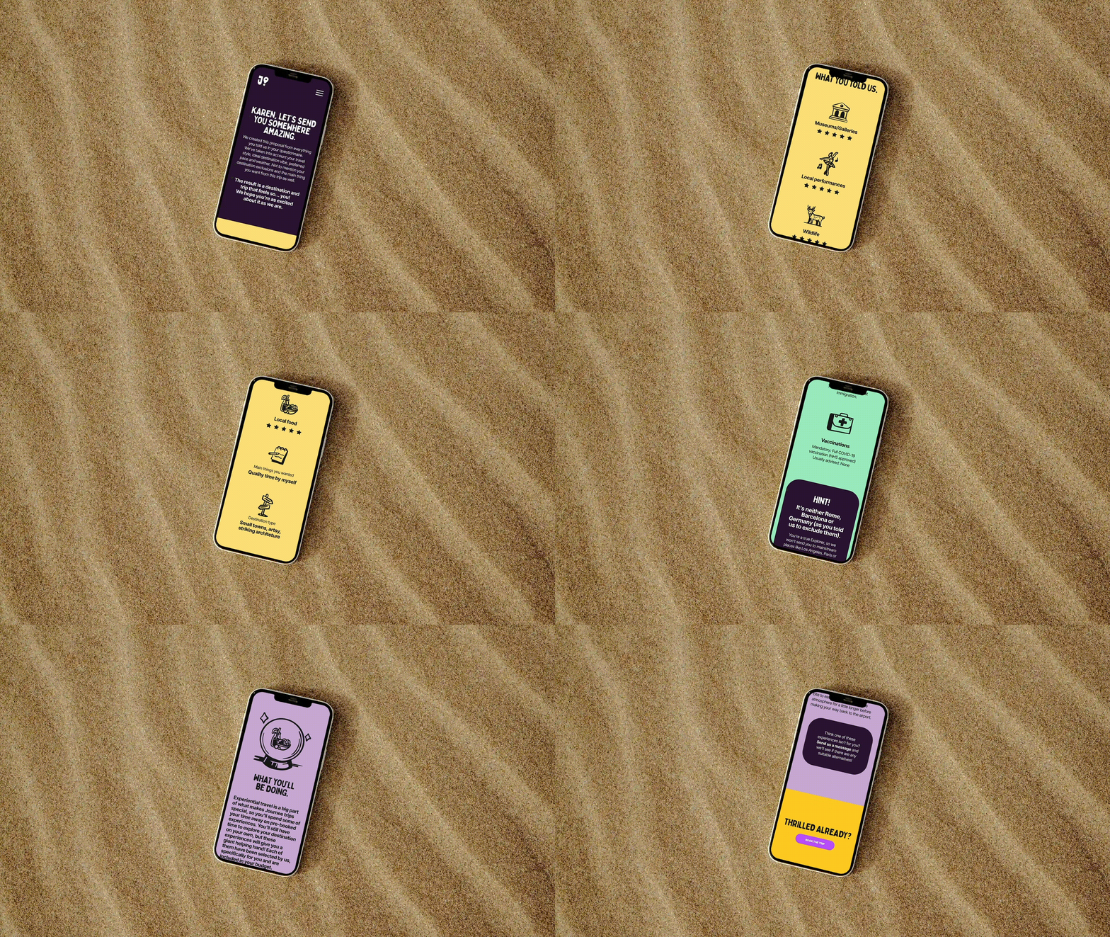
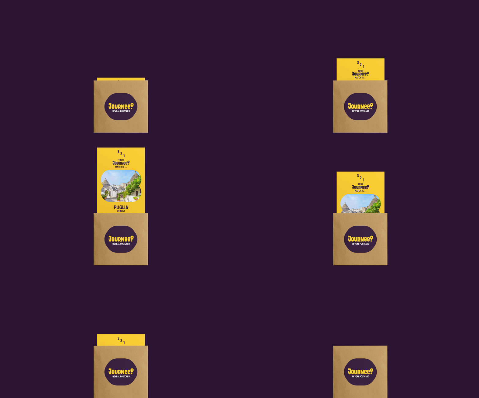
We developed a new identity system rooted in brand strategy, aiming for visual appeal, distinctiveness and practicality in its day-to-day implementation.
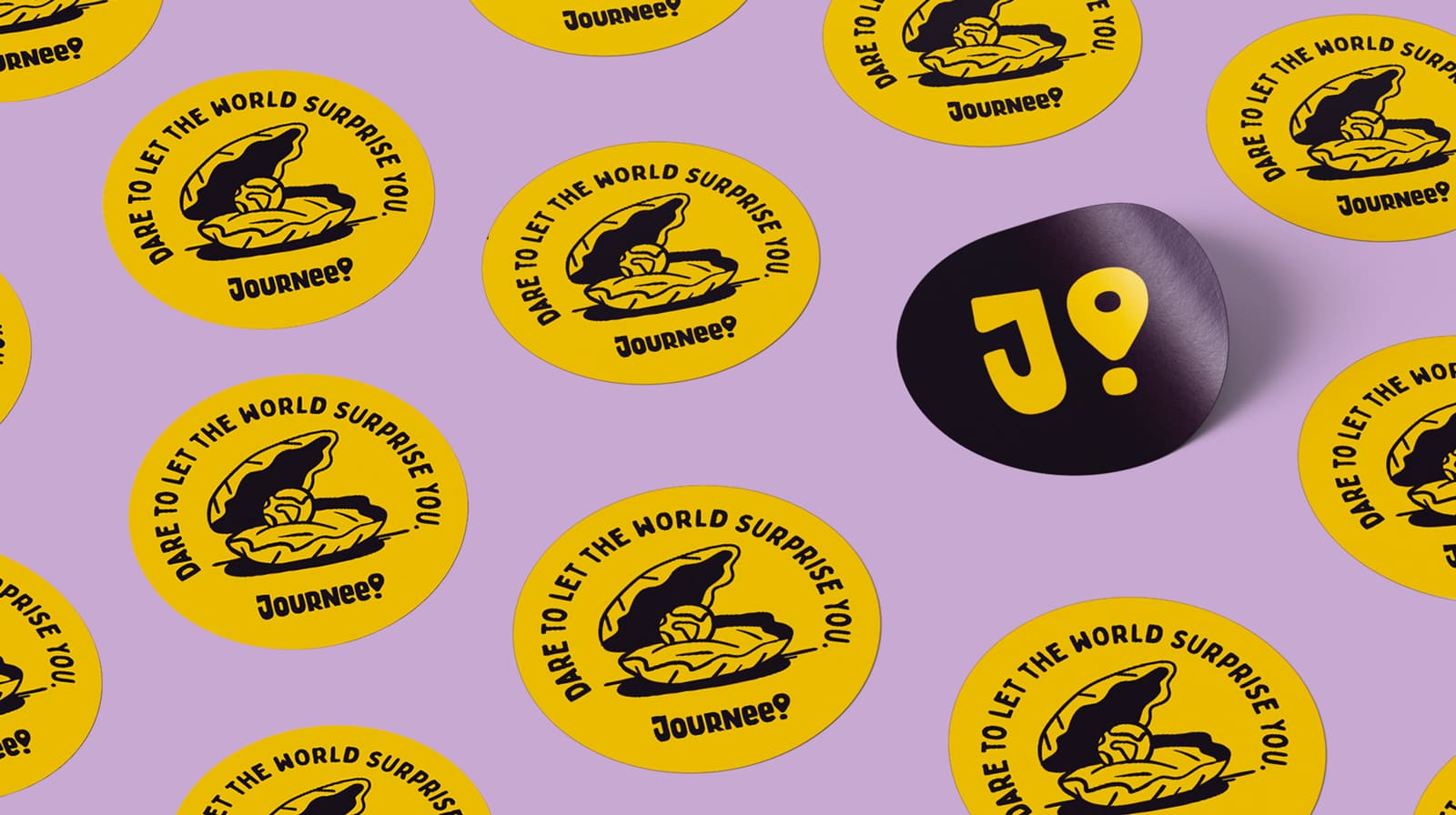
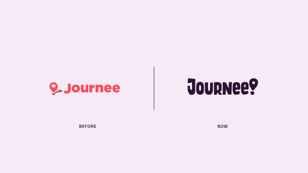
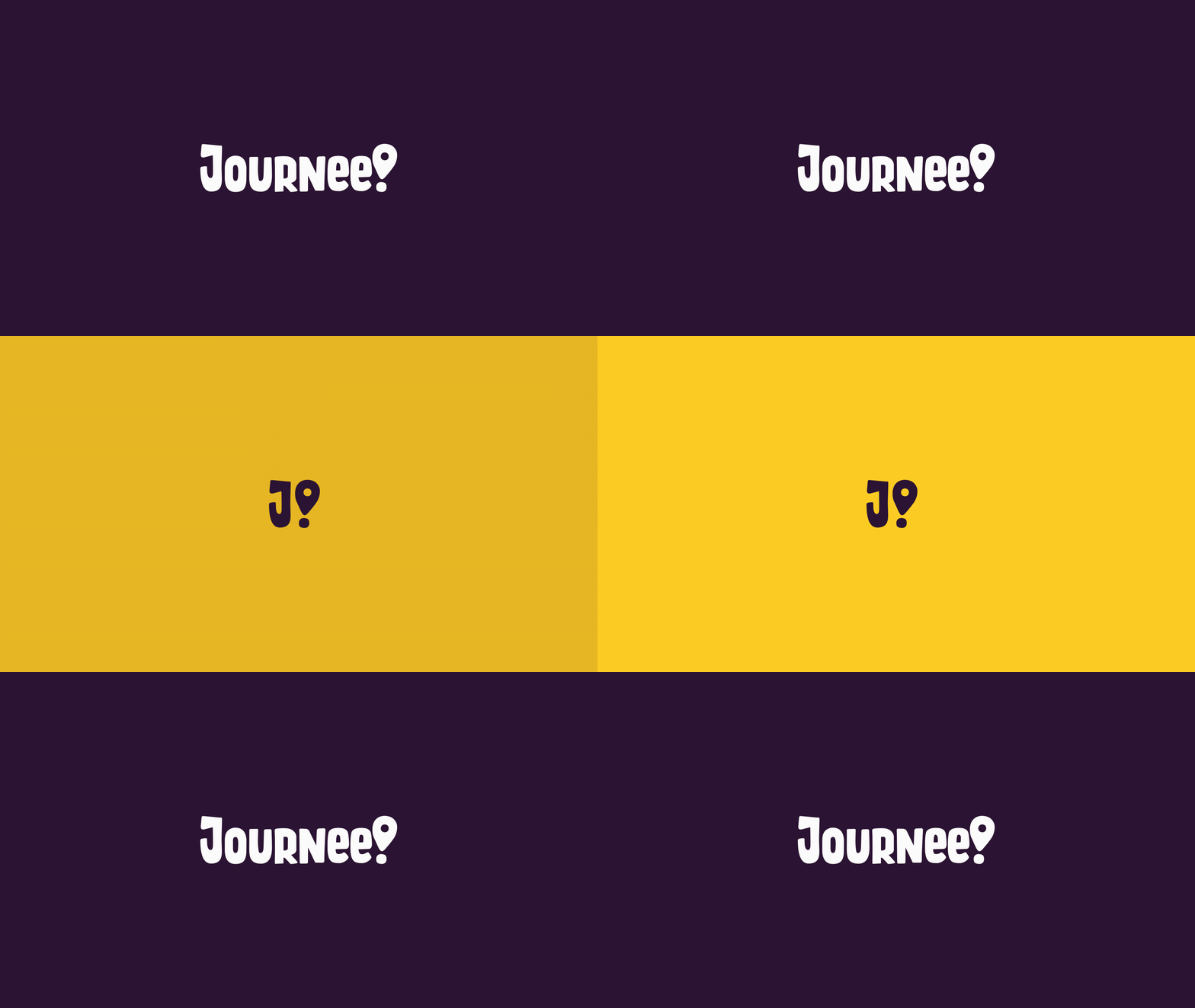
The new wordmark evokes Journee’s hero attitude while also depicting friendliness. Their location pin now doubles as an exclamation mark to communicate the excitement and surprise element that they provide.
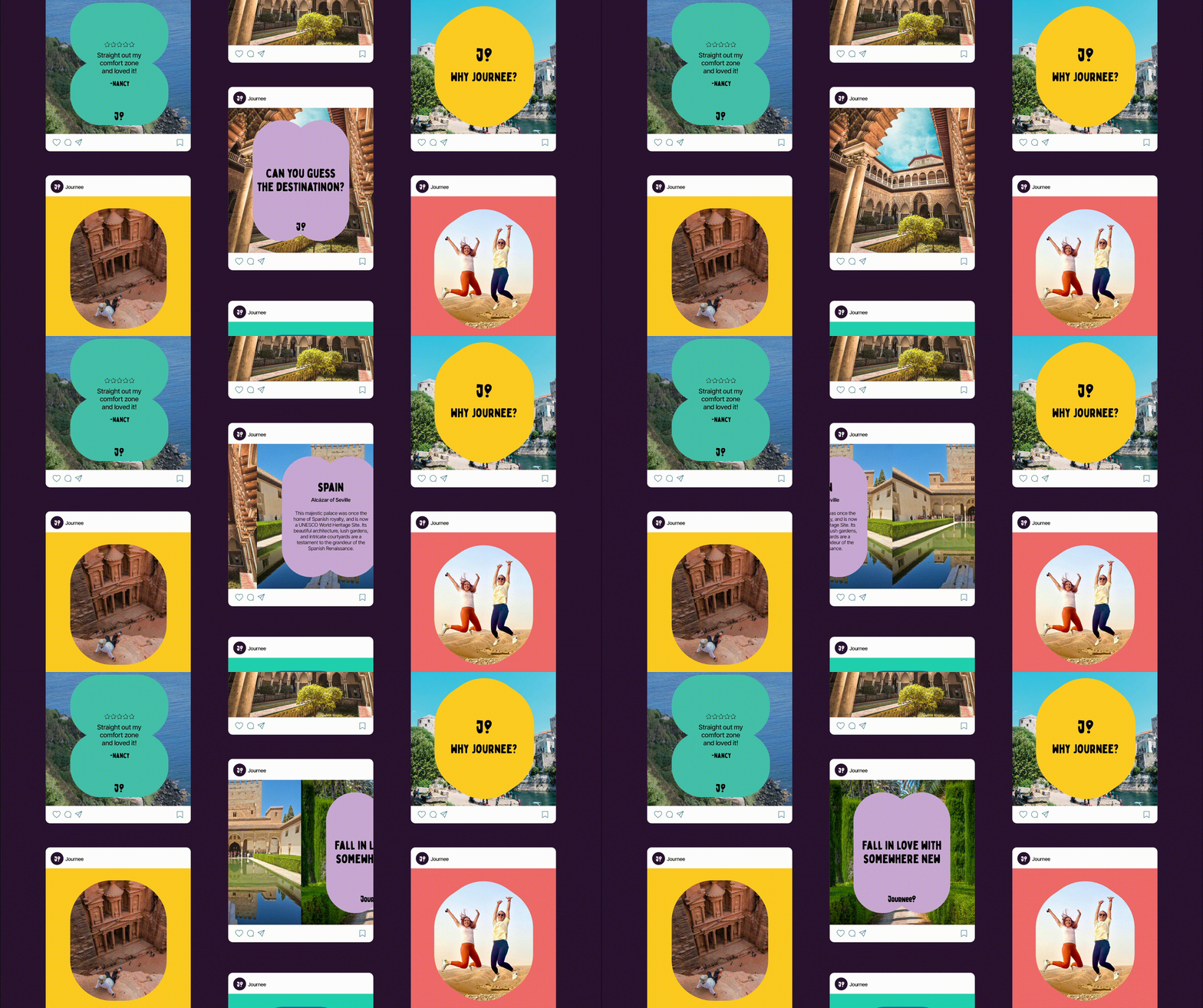
And then there’s the colour palette. Say goodbye to boring Airbnb-ish coral and hello to ‘somewhere yellow’ and ‘daring purple’—a combo that catches the eye and gives their audience the hero status they desire.
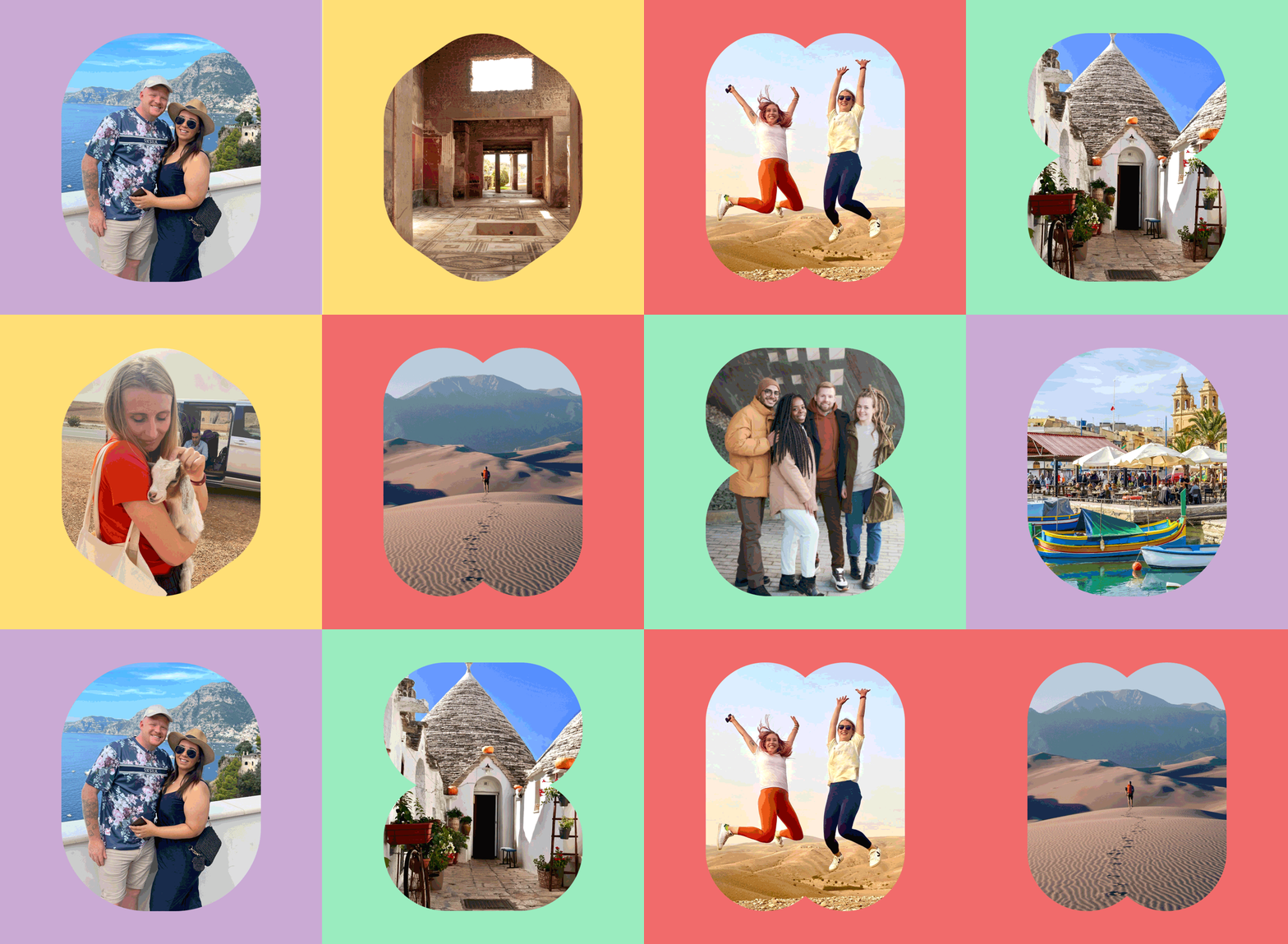
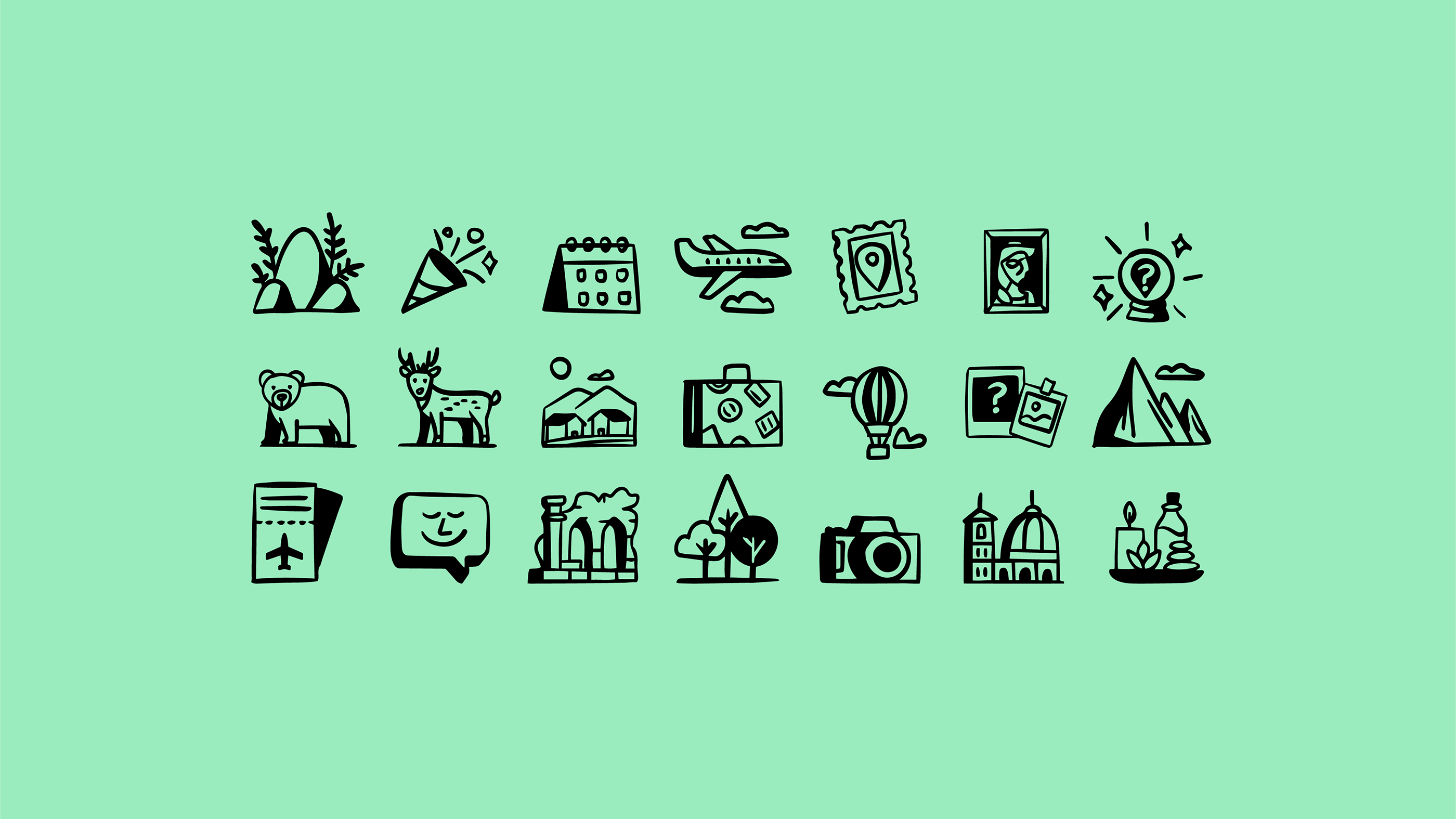
We paired the system with an urban illustration style, reflecting the lifestyle, edginess, attitude and individuality of their brand and target audience. And then there’s the new accompanying asset: the shapes. Inspired by memory games where different shapes must be matched to their equivalents, this resource conveys their playful spirit and how they match people to unconventional destinations based on personalities.
